Fresh Finds
Discovering new content is essential to the business of streaming services like Spotify. But often times we feel bored, listening to the same songs over and over again. It feels difficult to discover our next favorite song or artist by picking through the sea of playlists in Browse.
Fresh Finds is a Spotify feature designed to make the music discovery experience more engaging, adventurous, and intentional. It filters through the millions of songs to ultimately provide 3 options for the user to sample.
This case study is an individual project executed over the course of a month, and is not affiliated with Spotify.
2020 • Product Design

Spotify’s Browse does not encourage music exploration.
I wanted to understand how Spotify subscribers were finding new music that they love. I chose to focus on music discovery because it is an important part of the streaming business. If subscribers can’t find, explore and enjoy new music easily in Spotify, they may no longer find their $10 monthly subscription to be worth it.
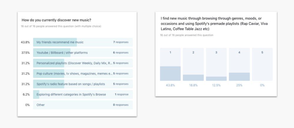
I sent out a short survey asking Spotify users how they find new music that they love, specifically defining the term “new music” to be music that they would save to their library. In comparison to Spotify’s personalized playlists and radio playlists, Browse was the least used music discovery feature on the app, with only 1 out of 16 participants saying that they currently use Browse and almost 50% saying that they never find new music they love in Browse.

People are not engaging because Browse looks overwhelming, and its content almost never changes.
Why do people have difficulty finding new music in browse and why is the feature so underutilized? I conducted interviews with 5 Spotify premium subscribers.
Boredom Due to Familiarity
“I hardly ever use Browse. I feel like I know what playlists are under each category.”
Too Many Options
“Browse is overwhelming, there are too many options. It’s very colorful but nothing calls out to me.”
Lack of Real Connection
“Playlists are good, but I don’t feel attached to the new songs that I’m finding.”
How might we make the browsing experience more digestable and frictionless?
I wanted to re-design the browsing experience and address the main pain points: 1) allow for a variety of music styles 2) and make it appear less overwhelming 3) but still new and exciting.
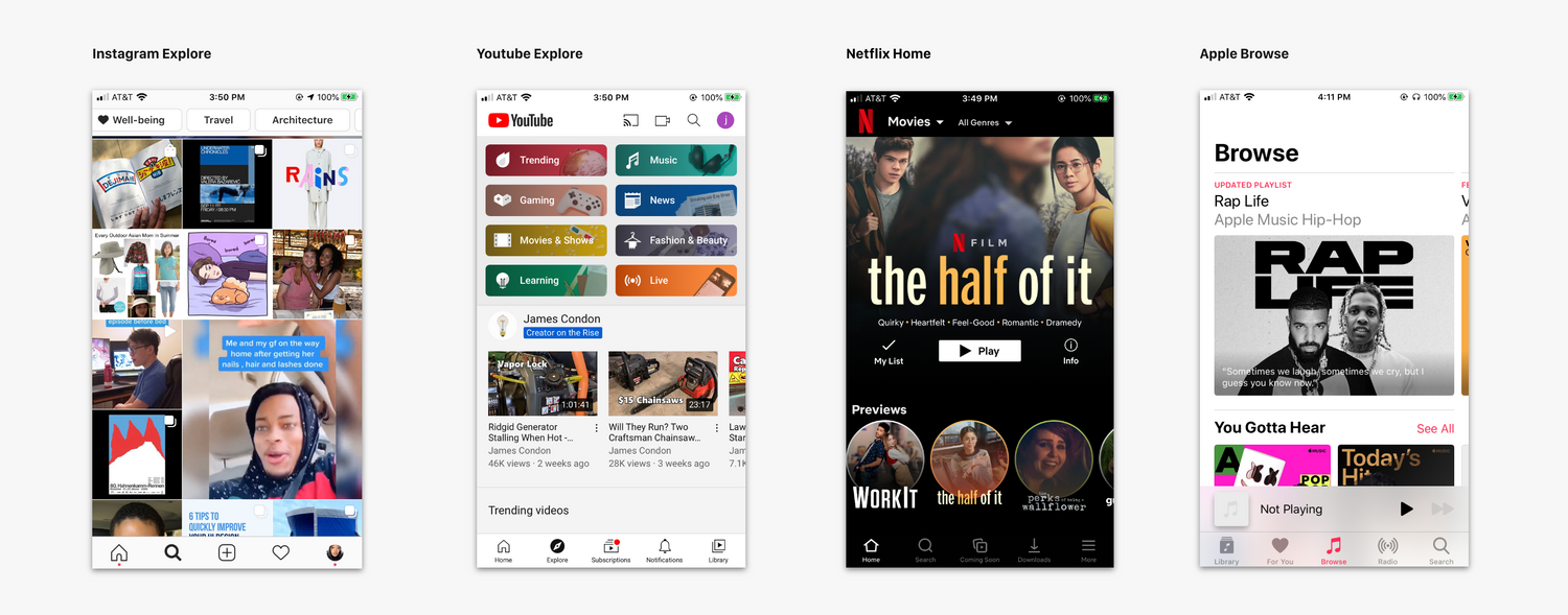
I looked to other streaming and media services such as Youtube, Netflix, Apple Music, and Instagram. I noticed that browse was very visually engaging and often offered a preview of the content. This is difficult for an audio platform because audio requires more investment to enjoy. It’s not easy to choose which content to explore because the user can’t tell from the album cover whether or not he or she would like the music. Hence, by narrowing down options in Browse, users would be encouraged to explore and engage with audio.

I decided to design a feature that narrows down choices to introduce you to new music.
One option could be to add filters and tags, such as genres or time period, that the user can apply underneath the search bar. However, this would be disruptive to the current app, since filters and tags may need to be implemented consistently across the platform.
Another option is to offer a step by step experience that allows the user to curate their tastes, similar to the on-boarding process that lets you select your interests and curate your feed.
I went with this idea because it had the potential to have more visuals. I also decided that the feature would provide a final selection of 3 songs, rather than albums or playlists. This is to lower the barrier to trying out new music: the listener can most quickly judge whether he or she enjoys the song and move on to the next song.

I sketched what the user flow would look like for this feature, which breaks down into 4 key components. First is filter, which narrows down the listening options, by presenting information in a short and digestable format. Second is intrigue, which presents previews of 3 final options, without revealing the full song information. The third phase is actually deciding and listening to the chosen song. The last phase is evaluating what you just heard, in which the listener may add the song to their library or share it with their friends.
Entry Point: A permanent (but still exciting!) feature
I first considered introducing the feature through a pop-up because Spotify has previously introduced personalized experiences through pop-ups. But these experiences were designed to happen outside of the app because they are unlikely to be re-visited by users. On the other hand, this Fresh Finds feature could be used as frequently as every day.
I chose option B because it felt the most integrated with the existing Browse structure. Pop-ups were too disruptive and impossible to revisit, and option C. an on-off toggle mode, would require restructuring the way Browse works. In designing the card, I made it appear similar to the other cards in Browse, with a tilted album cover.

Feature Design: Immersive but still feels like Spotify
What should the experience would look like upon entering the feature? I debated between a full screen pop-up, similar to Spotify’s stories, and an individual page, similar to the Concert page.
I had initially gone with option A because it felt more unique and exciting. But after getting two users’ feedback, they said that the experience was too disruptive. I switched over to option B, which allows you to listen to your own music as you browse and filter. The individual page felt more incorporated into the existing ecosystem of the app, and with the vertical scrolling, it feels more like the feature is literally helping you filter down.

Displaying Options: See them all at once
I wanted the experience of picking options to be easy and concise. I showed all 4 options below to a Spotify subscriber for feedback and learned that she liked seeing all the options at once instead of having to scroll. The text buttons were too simple and not exciting, but the image-buttons were too random and abstract. The existing tiles from Spotify, option C, would feel the most familiar to the user. I also added a refresh button in case users were dissatisfied or strongly disliked the available options.

Song Preview: 30 seconds of focus
Finally after selecting a genre and mood, 3 songs are presented to preview. I decided topresent these final options in a carousel view because I wanted to showcase the album covers and catch people’s attention with the visuals. The song title and artist are not revealed until after a final choice and the preview only allows the user to listen to the first 30 seconds of the song.
I decided that the 30s song preview should be even more immersive, as if they were diving into the song. To create focus and active engagement time with the content, I went for the full screen pop-up. The preview shows an enlarged album cover and scrolling lyrics. Since the preview lasts only a few seconds, the conventional controls (play, pause, speed up etc) are unnecessary and helps the user focus in on the music.
Final Design
The Fresh Finds feature is accessed from browse, sifts through music depending on the user’s genre and mood choices, to present 3 final songs. The user can preview the songs and make a final choice, as to which song the user is most interested in.
Retrospective
It’s been 3 years since this case study was written and I’ve gotten to see how Spotify has evolved and how it has improved its music discovery experience.
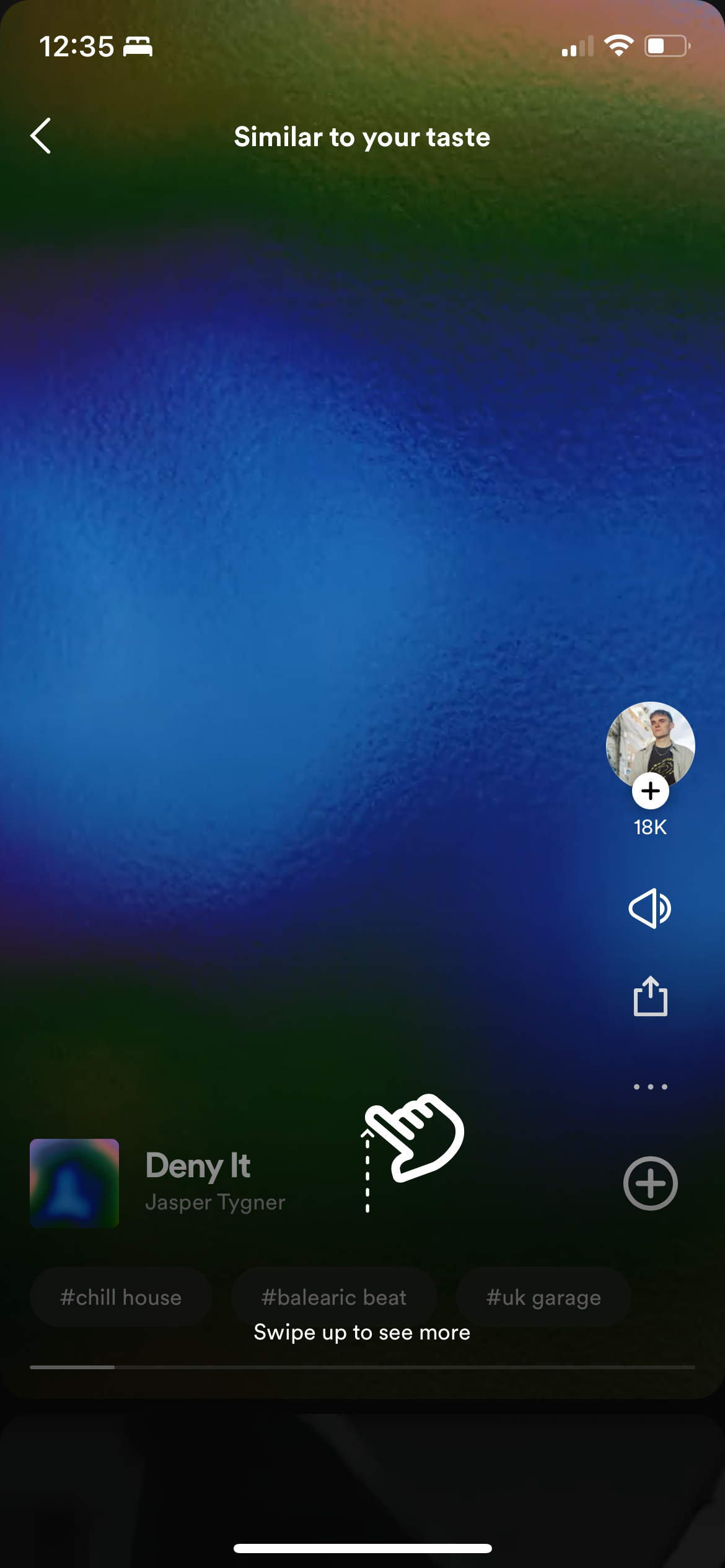
They did incorporate a song previewer similar to my designs! It lets you listen to snippets of songs and “swipe” them similar to a reel if you want to move on to the next song. You can see these on the song previews as on the home screen.

